Tuesday, 7 March 2017
Vlog of our Final location
Faith did a bloopers edit video from yesterday, giving a little insight into our location and what we did, and what did/didn't work, along with some funny moments.

First Poster draft
After a good photo-shoot with Faith and our protagonist, i started editing the photos of our main protagonist, and after a lot of hardwork using the paint.net tool i found online, i was able to effectively editall of the poster, giving it a professional feel towards it.


As i began using new software to edit our photos, I struggled with using Paint.net majorly as i had never used a photo editing tool before. I didn't know how to use any of the tools at the start, and what layers were or how to use them. After realsing that i would not be able to make a professional ancillary task on my own, i accessed the web 2.0 and began searching for some help.
I looked on Youtube and found a video (to the right) that helped me to grasp the basics of the editing using Paint.net. It shown me all of the tools, like the colour wheel and the layers, and what to put in each layer and how to rename them so I know what is in each layer, and how to use them effectively to get maximum benefits. For example, I was shown how to use the blur tool, and this worked brilliantly for my background. It also shown me how to highlight certain points in the poster, bringing out the characters face and the missing poster, for example.
I was also shown the blur tool whilst using letters, and i created a fading lettering around the title "Missing". The red blur helped to make the title stand out against the background a lot more, contrasting between the bright red title and the dark dim background. I was also shown how to select certain parts of the poster to change the saturation and hue of colour. I made the poster in my protagonists hand high in contrast and saturation to draw the audiences attention towards it as i wanted to emphasise the missing person on the poster, so the audience can recognise the character on both the poster and the missing poster inside the poster created.
Monday, 6 March 2017
Tomorrow!
Tomorrow is the day we're recording for our media production and i can barely sleep! Both I and Faith are prepared for everything! Bring it on!

Final cut pro is a lot more specialised in film editing than Apple's IMovie, with special effects that the IMovie couldn't handle. It also has hue/saturation/exposure on a slider, meaning you can make it darker or lighter, depending on the mood you are attempting to create. Creating a horror, we prefer to lower the saturation (however, not on blood) and lower the exposure, to give a dark and night feel to it.
Sunday, 5 March 2017
Recording Issues
After several attempts to meet up and shoot the film trailer all of the original cast that were going to be in it we decided to swap around the cast due to their strict availability. After setting a meeting and shooting date of this Saturday, two of the four actress' also canceled on both me and Faith which highly irritated us. Therefore, we had to improvise some of the first scene, considering we would not have been able to do some of the shots we wanted. I could also not be included because our cast was strictly female as our antagonist liked to capture women. We also wanted a female protagonist so that we could also prove that women were strong as well, and can save themselves, going against many mainstream films that use women as the Damsel in distress' (going against Propp's typical character theory)
There was also issues with the location that we had decided to use in our film trailer, as we were constantly approached by youths of whom thought it was funny to create a lot of noise after being asked politely to be quiet and/or leave. After an hour of precious recording time wasted on getting rid of these pestering children, we carried on recording. Due to the season, it was already getting dark which had an impact on our camera quality. However, in light of this, i used two iPhone torches to light up the charater's face which contrasted against the background and immediately made our camera shots look more professional.
There was also issues with the location that we had decided to use in our film trailer, as we were constantly approached by youths of whom thought it was funny to create a lot of noise after being asked politely to be quiet and/or leave. After an hour of precious recording time wasted on getting rid of these pestering children, we carried on recording. Due to the season, it was already getting dark which had an impact on our camera quality. However, in light of this, i used two iPhone torches to light up the charater's face which contrasted against the background and immediately made our camera shots look more professional.
Thursday, 2 March 2017
Ancillary planning


 Looking at the conventional horror film posters online, as a group, me and faith decided to and sketch two film poster designs, following the typical layout of the posters online. We also noticed that there was a dark colour pallette, most of the time with a bright red to attract the audiences. In these posters, there was not always a lot of gore and is known to be a horror by its dark layout around the outside, and the darkened colours used. This normally sets the scene, and creates a sinister atmoshpere. The horror posters are normally quite simple, having a minimalistic set. We liked the idea of having one prop, the missing poster, as we wanted to emphasise that the film is about a missing friend and keep the audience.
Wednesday, 1 March 2017
Props- Poster
 We deicded that to make our Horror film and the narrative easier to understand we would use a Missing poster. When included in the Ancillary Poster, it will help with the narrative, to tell the audience what the basic outline of the Horror film is. Making our protagonist hold the poster helps to show that the story follows a girl and how she would do everything to find her friend. We felt that using a selfie would be more attractive to our audience, as our demographics are young adults, of whom would be constantly taking selfies, making an immediate connection with the 'Missing' character.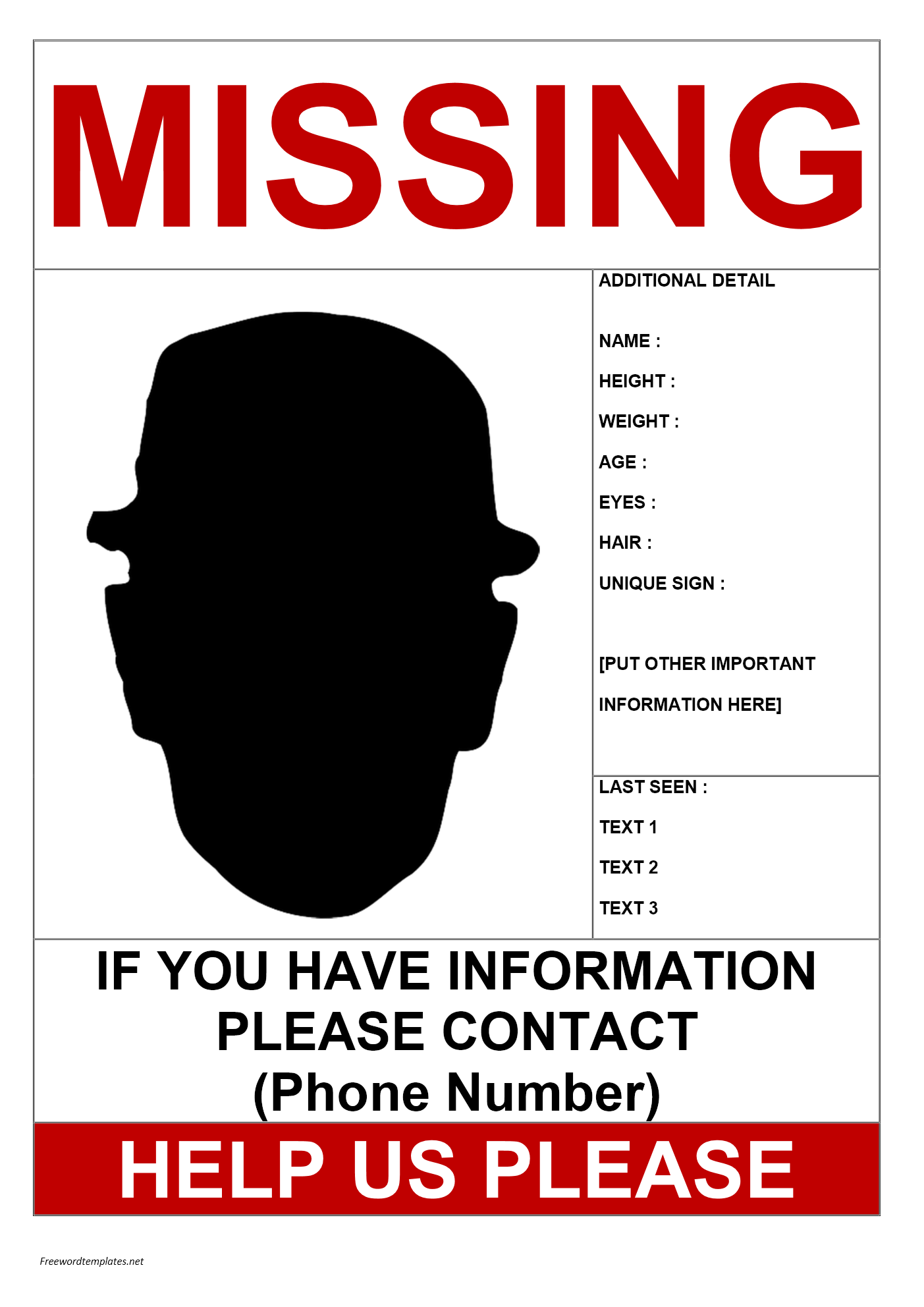
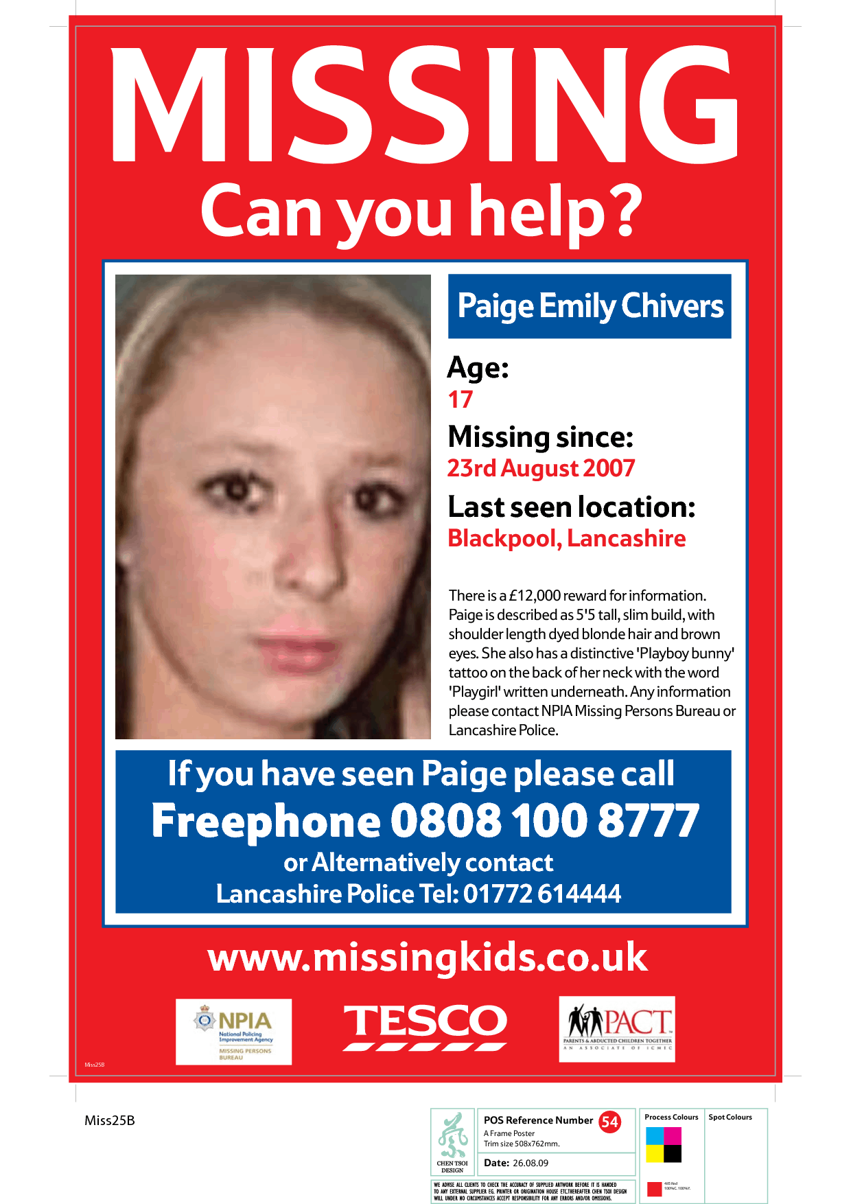 Looking at many conventional missing posters, the missing person was always in the centre and the photo of them was always large, grabbing everyone and anyone's attention. They were also very basic and normally just contained the words MISSING and a REWARD with some small print giving context about where they lived or what they looked like and who they hung around with.
Subscribe to:
Posts (Atom)